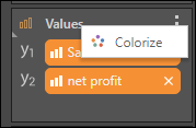
The context menu in the Values zone contains the Colorize function. This function applies discrete colors to measures in the query.
When creating combo charts and stacked measure charts, the values will automatically be colorized and added to the discrete color zone.
In other scenarios, you can click the Values context menu and select Colorize.
 \
\
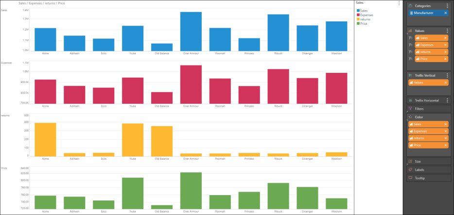
For instance, if you create a chart that's trellised by multiple measures, you can colorize the values to display each chart in a different color:
Once Colorize is enabled, each subsequently added measure will also be colorized. You can remove a measure from the Color zone to de-colorize it (red highlight).
Auto-Colorize
You can also access enable Auto-Colorize function from the Design ribbon. In this case, each measure added to the query will be automatically colorized.
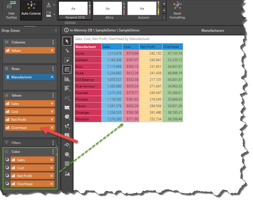
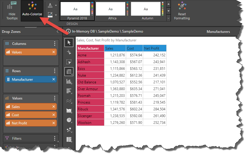
Click Auto-Colorize in the Design ribbon:

Note: If Auto-Colorize is enabled after the measures have been added, they will be colorized only when a change is made to the Values zone; for example, by adding or removing a measure.
Example
In this example, Auto-Colorize was enabled (red arrow) only after Sales, Cost, and Net Profit were added to the query. The columns in the grid are, therefore, not colorized:
But now, after Overhead is added to the query (red arrow), each column is automatically colorized (green highlight):